I have recently begun experimenting with Fluid Art and unfortunately discovered that its not as easy as it looks! I'm far from an expert, but here's my simple tutorial. It will probably change in the future, but I'll keep you guys updated!
This is a final piece; I'm going to take you through the process.

Final piece
1. I first spray a thin coat of varnish on the canvas (make sure it's a stretched canvas) to allow the paint to move across it easily
2. I then mix the colors I want with flow aid, water and pouring medium. First mix the flow aid and water 20:1. Add this mixture and pouring medium to the paint until you've got enough paint and the drips are continuous streams. Below is more than enough to cover 40x40 cm.

The paint
3. For this painting I attempted to be more controlled so I poured the paint in a pattern and attempted to spread it without disturbing it. There's no right way to do it, you can pour them all into another cup and pour this, or flip the cup onto it (a dirty cup pour). To spread the paint simply tilt the canvas in what ever direction your want it to fall.

Applying the paint
Below is what it looked like after I finished pouring and spreading.

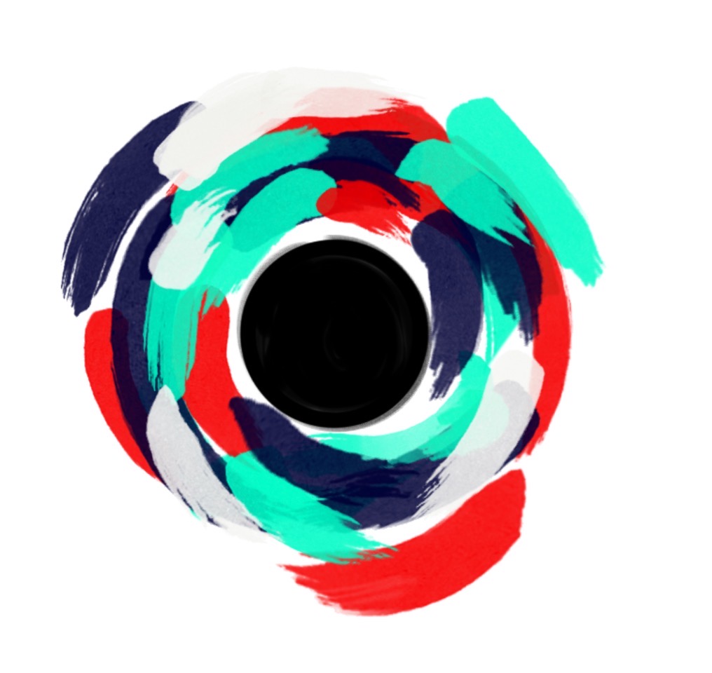
4. I then added more detail by swirling the paint around. If you do it when it's wet the paint will Reform with the pattern you create but if you wait too long or move too much it will create a 'hole' in the surface. You can also use this method to correct any stray drips like the blue drop in the bottom left corner. Lift it out with a straight edge (some cardboard or a chisel tip rubber brush and move the surrounding paint to close over the gap.

Adding detail
And here is the final piece!! I added more detail almost exclusively in the center.

Final piece
I've been watching a lot of tutorials and looking at a lot of fluid art pieces to come up with this technique but I'm still learning! So let me know if you have any suggestions! Comment below!
Shivani