Building a Portfolio

Assembling a portfolio can be very difficult. The process is full of hard decisions. To me, the key is to be impartial; be critical of your own work. These are the steps I followed for my portfolio to 3 universities and an architectural firm. Please don't take these as concrete steps to build a portfolio; this is simply how I went about it.

1. Research your firm/university/organization

Research: what your organization stands for, some of their outputs and what they ask of their candidates. Their website would be an excellent place to look for this information but look at a few articles written about them as well. If you can talk to someone who has or does work for them, take advantage of their experience! Ask them for advice!

2. Assemble high-quality images of all your work

Photograph all of your work with white diffused lighting and a neutral background. Try to prop your work up (as upright as possible) and crop the image to make your image appear upright (photoshop has an angled crop tool). You don't need a professional camera, most camera phones will do the trick as long as you have decent lighting. Make sure you edit each image: up the saturation and contrast a little and reduce the exposure to avoid bright spots. 

3. Filter your work according to your needs

Refer to your research and filter your work accordingly. Be sure to be critical of your work and include your best! Consider including drafts and development works if you think your organization would appreciate it. You did the work! Show it off!

4. Group your chosen works

Sort through your chosen works and try to group them by media or concept. Play to your strengths; it's ok if your most frequent media is your biggest section. Just don't let it be the only media you include - you need to show versatility. 

5. Write blurbs and labels

Every image must be labeled for someone to be able to understand your thought process. The label should include:

Title, Size, Medium

Write a short blurb (a few sentences) for each final work to bring home your concept. Add a sentence to explain the development images as well. 

6. Assemble pages

Assemble pages according to your groups. Make sure you check any size requirements from your organization (page sizes and number of pages). The amount of work on a page will be dictated by the size of the page, the number of pages and the attention you want to bring to the image. Leave space for your blurbs and labels! For a clean and coherent layout try overlaying a grid while placing your images (in photoshop: View > show > grid). 

7. Export/ Print

Finally, export and collate your pages. Make sure you meet the file size requirements. If it's too large, reduce the size of each page by lowering the quality (in photoshop: appears in a pop-up window after exporting). Label your file clearly before uploading or sending it! If you're printing your portfolio, make sure you print it on high-quality paper and protect the pages with a cover and packaging before sending it off!

Hope that helped! 

Shivani


Art is a Language is an online portfolio as well as store for Shivani Sarjan’s artwork; focusing on sharing development, processes and final works as well as how an amateur artist may accomplish these. 
Choosing a Title

Choosing a title for your work can be difficult. It's tempting to just call each one Untitled and let the work speak for itself. Don't give in!! I know what you're thinking - but so many famous artists have done it. Yes, they have, but they also have had highly acclaimed art critics to analyze their work and then publish their analysis. (Did that sound rude?? I didn't mean it to!) 

Ok, my point is, choose a title that will support your work. That will bring your idea, your concept, across to the viewer. This is extremely useful as your audience may not know you; they may not know that those hands are not just a pair of hands but a symbol for relationships (for example). 

Easier said than done, right? I had a lot of trouble with this as well. Let's take a look at some examples (cue shameless plugging of my own art). 

Variation (Acrylic on Canvas, 100x 100 cm)

I titled this piece Variation as the concept behind it was to display the variation one emotion can have through shades of gray. The title immediately directs you to the shades of gray if not the emotion. The title of the exhibition (Displaying Emotion) would lead to the emotion behind the painting. Variation would also lead into the blurb for the piece. 

The use of texture, shape and line accentuates the grey scale of colors used
which portrays the range a single emotion can have. It is disorganized and
several areas bleed into each other to show how blurred the lines between,
for example, simple frustration and potent rage can be. It focuses on the use
of black and white and the grays to represent the scale of a single emotion,
though the emotion itself is open to interpretation.
— Exhibition Blurb ; Displaying Exhibition

Struggle and Strife (Acrylic on Canvas, 100x100 cm)

As part of the same exhibition, this piece was titled Struggle and Strife. I choose this title to highlight the struggle between not only the two contrasting colors but two contrasting emotions within one. The title leads the viewer to the conflict expressed by this painting. This then leads into the blurb:

This piece’s purpose was to depict two emotions, namely anger and
depression, conflicting with each other. The composition itself is a gradient -
the colors are harmonic at the top and warring at the bottom. The use of
primary colors is not only visually appealing but makes the emotions
portrayed seem childish. The use of a yellow ochre in the background
accentuates the contrast between the piece’s colors . This compounds the
idea of two emotions that become more and more conflicting.
— Exhibition Blurb ; Displaying Emotion

I hope that helped you name your paintings! Please try to! It really brings across the idea behind your work.

Shivani

Bauhaus Exhibition

Recently, two of my paintings were included in the Bauhaus Prairie Art Gallery as part of a competition. I am, of course, extremely proud of this but would also like to draw your attention to this gallery for not only this exhibition but all of its shows. It's an amazing gallery in the USA which includes artists from all over the world (making many of its shows purely digital.

Heres the link to the show, I was included in. Check it out!

http://bauhausprairieartgallery.com/category/show/december-2016/ 

Shivani

Abstraction

Abstract art, to me, has always created very personal art. This is why so many people find it very difficult to appreciate it and therefore put it down. Many expressionist artists, however, have very good reasons for why they have drawn that line or that shape. And it cannot be easily expressed, though it is quite clear in their heads. So it is very difficult to bring a stranger into the thought process that led to a particularly abstract piece. A skin-deep appreciation can always be created but for many, it is quite an undertaking to look deeper and truly understand a piece. Having said that, art should be interpreted by each person individually. It may have meant something different to the artist, it may mean something different to a stranger. 

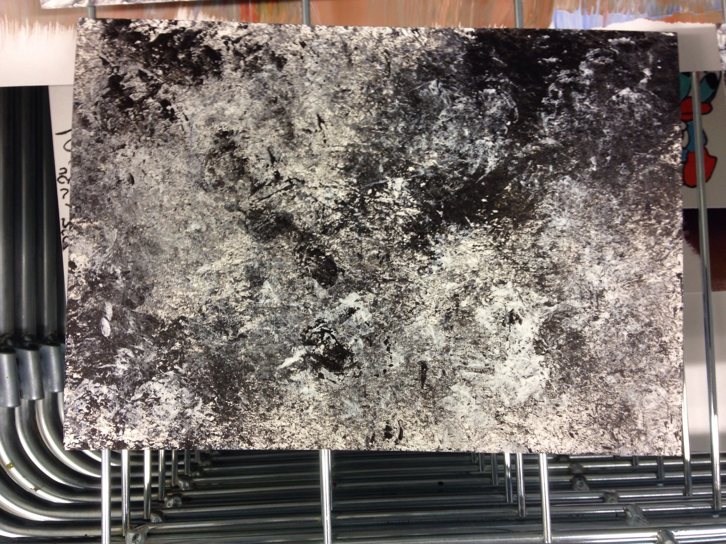
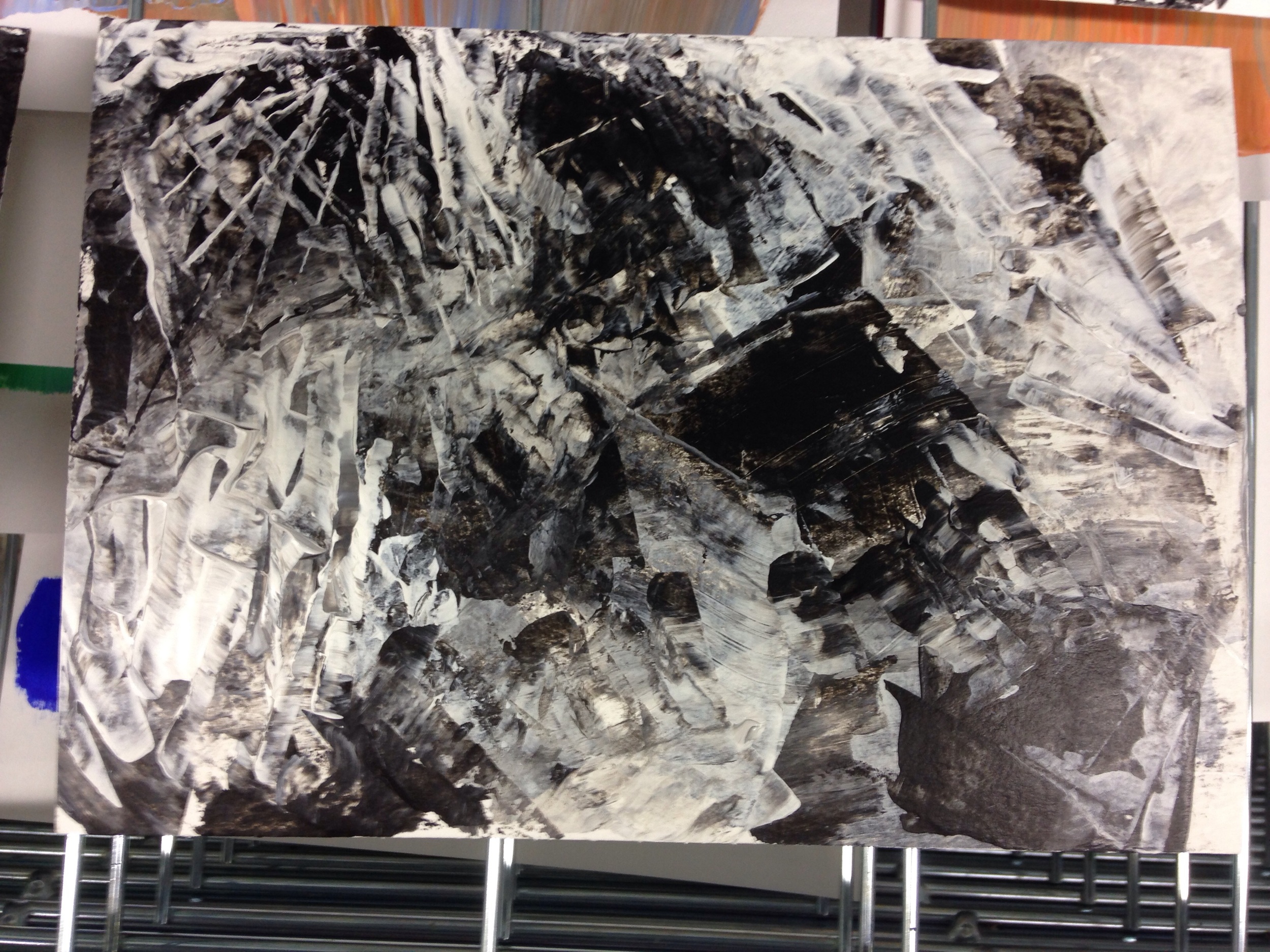
I have recently been working on some very abstract pieces, which are quite different from my 'normal' style.  


image.jpg
image.jpg

I used 4 different techniques to create these pieces: layering and blending them together.  


Application with tissue

Application with tissue

Application with pallete knife  

Application with pallete knife  

Application with card  

Application with card  

Application with plastic scraper 

Application with plastic scraper 

I used acrylic paint with a glossy gel medium, to thicken it. It lead to some interesting textures which normal Acrylic would not have held. 

I really enjoyed doing these, interpret them as you wish.

Shivani  

A Brief Note on Line

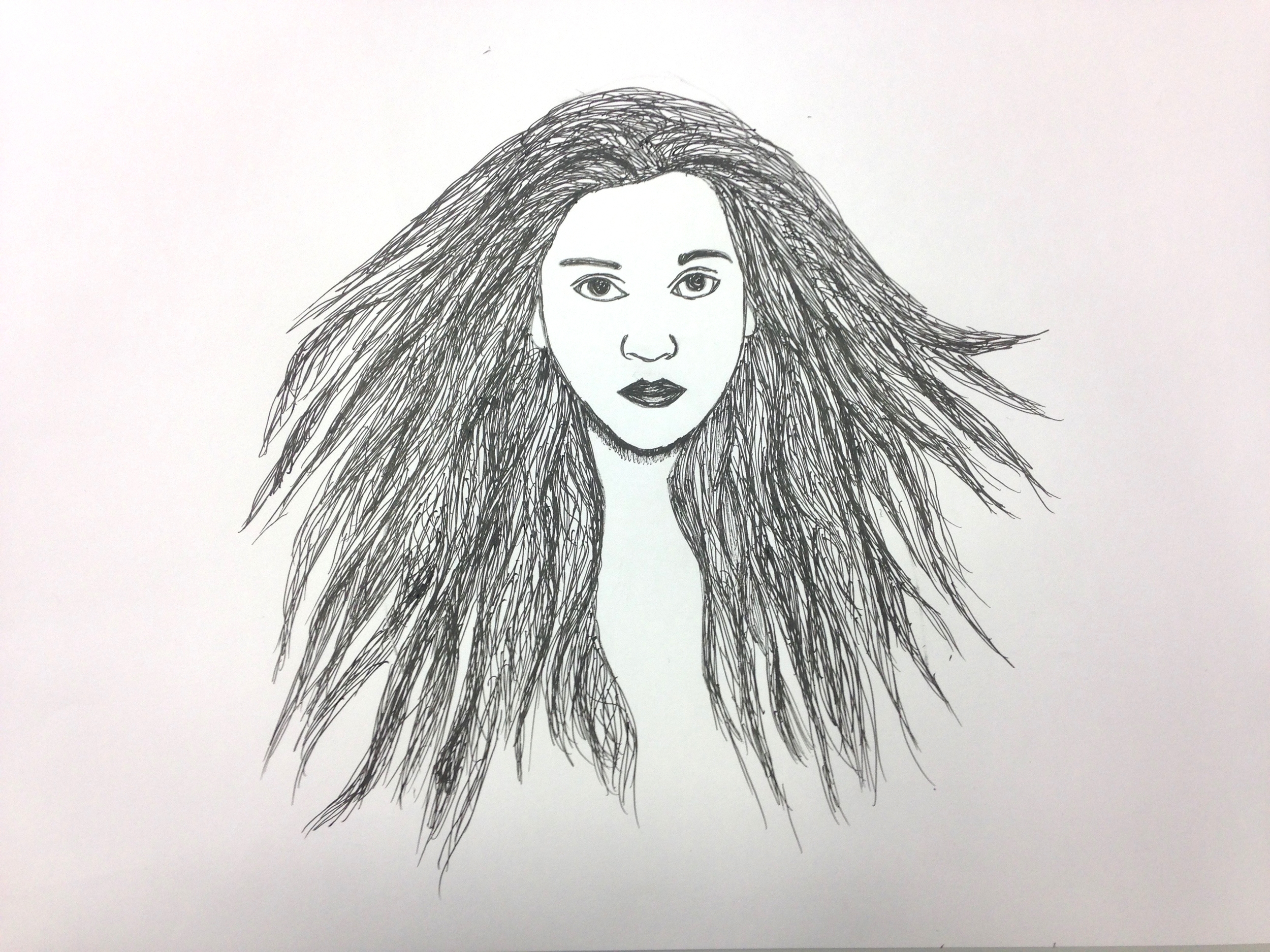
Line, though a formal factor in the analysis of any and all art, is important in life too. It can represent boundaries, goals as well as more solid things such as a simple profile. The arts have always used it many different ways. In my opinion, the modern abstract movement sweeping through visual arts has made it rather more arbitrary. It has always been interesting to me, as a valuable and flexible part of any composition. Unfortunately, I have never been able to do very much significant work with it but my sketchbooks are full of simply line drawings, cross hatching, and shapes.  Having said that, here's my recent work with line. I loved doing it and hope to further develop these. 

I suppose these can be called self portraits, but to be honest, I used photographs of myself as references. They were definitely not meant to be self-portraits. 

The above picture is a detail of one of the pieces. I included it just to show the shapes created by the lines. I found these interesting and strived to create them in the above pieces.